A TWELVE-UNIT FOUNDATION
CAP HEIGHT
Rg
BASELINE / 0600 UNITS →Every curve has a reason.
A measured grid, deliberate ink traps, and a fixed-width rhythm. Geometry that earns its keep at any scale.
Precision for the terminal. Character for everything else. Meet BravoZulu Mono: a typeface drawn on a twelve-unit grid, with a voice all its own.
Your words. Our type.
Click below and start typing.
Optical correction moves from Screen (0) to Display (100). Available in Regular and Italic.
Made for close reading.
Worth a closer look.
A measured grid, deliberate ink traps, and a fixed-width rhythm. Geometry that earns its keep at any scale.
A single-storey a, a descending f, and distinctive exit tails. A drawn italic with its own maritime character.
Explore the figures, letters, and punctuation side by side. For code, commands, and the words between them.
From a line of code to a line of bearing.
Same type. A different kind of flow.
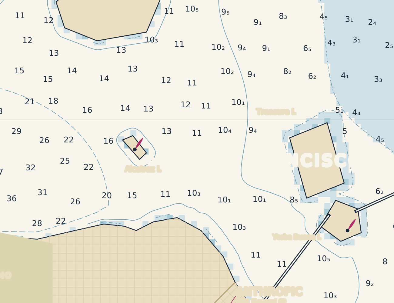
Four weights.
A true italic for each.
Latin, symbols, box drawing.
And room for a little expression.
Arrow keys to explore · Home / End within a row · Ctrl / ⌘ + Home / End for first / last · Tab to copy
Bravo over Zulu. A naval signal of a job well done, and a fitting name for a typeface made with care. A small salute to the things you make with it.
The complete BravoZulu Mono family is being prepared for release.
FONT DOWNLOADS WILL BE AVAILABLE AT RELEASE.